

Take A Look Around This Renovated Country House
The Property
This country house in the Cotswolds is near Chipping Camden. It has four reception rooms, a playroom, six bedrooms and five bathrooms. It was seven bedrooms and five bathrooms when our client bought it, but we reconfigured the first floor to enable most of the bedrooms to have an en-suite. It’s owned by a longstanding client of ours, whose London house we’ve been working on for the past four years. He bought this house in the summer of 2020, as a home for his family to spend weekends and holidays, as well as somewhere he and his partner could entertain friends.
The Brief
The brief was to create a young, colourful, country house and introduce a bit more character. The house was entirely cream with the odd floral fabric dotted around, and the bathrooms were very basic and tired, so it needed a complete overhaul. We reconfigured the entire first floor, redesigning all the bathrooms and bedroom joinery, and also came up with new decorative schemes throughout, which included exposing the oak ceiling beams in the reception rooms. The main challenge was the timescale: the entire project had to be finished within nine months but Covid meant meetings had to be virtual and the supply chain issues were numerous. Everything from the fabrics to the hard finishes either had to be in stock or available on a short lead-time, without compromising the end result.
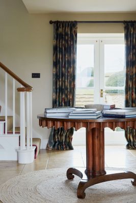
The Entrance Hall
This is the entrance hall, but there is a fireplace at one end so the room doubles up as a reception room. For that reason, adding curtains from Lewis & Wood to all the windows and French doors was important to make the space feel cosier. Because the room is dual aspect, you can walk through the front door and immediately have a beautiful view of the garden through the French doors opposite. At this end of the room, we wanted to maintain more of a traditional feel. We looked for an antique table but ended up falling for this beautiful William Yeoward piece instead, with a rug underneath from Soho Home.


The Downstairs Loo
I’d wanted to use this Jet By Whiteworks wallpaper for a long time – especially paired with red woodwork – and this little guest loo ended up being the perfect space in which to use it. The mirror was an existing piece that needed to be reused. I wouldn’t ordinarily mix gold and silver tones, but the antique frame actually works nicely with the brass wall lights from Hector Finch. I love the basin from The Water Monopoly; it’s such a pleasing shape and so practical to use with wallpaper because it has its own backsplash. We changed the door swing in this room so we could fit it in.

The Main Reception
Because there are a number of reception rooms in the house, and this particular room was predominantly going to be used in the evenings for watching TV, we were able to go bold. The colour is Inchyra Blue from Farrow & Ball and I felt it was very important to use it on the ceiling and woodwork as well as the walls, in order to create a truly enveloping space. The fabulous rug, made bespoke for us by Ptolemy Mann, informed the rest of the colour scheme. The rug is my favourite element in this room. I think Ptolemy is incredibly clever with her designs and use of colours. Our client wanted to use a sofa from Timothy Oulton in here – this one is incredibly comfortable and perfect for movie nights. The generous club fender is by Acres Farm, upholstered in Fermoie. The sheepskin cushions are from The Conran Shop, the sheepskin on the window seat is from Graham and Green, the armchairs are from Soho Home and the cushions on the armchairs are from Fermoie.
The Dining Room
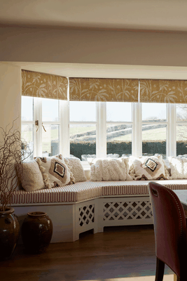
As we painted the kitchen cabinetry a deep burgundy colour, this window seat at the other end of the room needed to complement that. The striped fabric on the seat cushion from Guy Goodfellow Collection was a way to introduce the right colour, while keeping the window seat light and bright. The Fermoie botanical print on the blinds is a little nod to the view of the garden and hills beyond. The antique decorative pots on the floor belonged to our client and looked great here. The view beyond the window is stunning, so it was great to be able to create a comfortable space from which to enjoy it.
The Main Bedroom
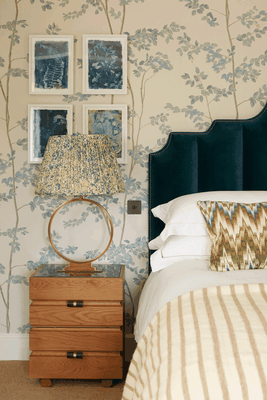
Blue was requested for the master bedroom, so the colour was the starting point for this room. We wanted to introduce it in as many elements as possible, so pattern was important in here to help us do that. The chest of drawers and antique mirror above it were bought with the house and were perfect for this room. Our client was also a big fan of Soho Home, so requested to include a number of pieces from the brand’s collection throughout the house. I love the wallpaper, it is one of our favourite Lewis & Wood designs, but we haven’t used it in blue before. The artwork is Cyanoprints by Kate Mullock, the lamp on chest of drawers is by Vaughan and the throw is Maud Interiors.

The Main En-Suite
The Zellige tiles from Otto in the shower and bath add extra texture and interest that really complement the bronze sanitaryware from The Water Monopoly. The bath is such a pleasing shape, a lovely take on traditional freestanding tubs, and I love the vanity unit from Porter Bathroom. I also love how the original exposed timber door and jute rug from Soho Home add warmth to the space. The blind fabric is Sarah Vanrenen for Penny Morrison and the wall lights are Original BTC.

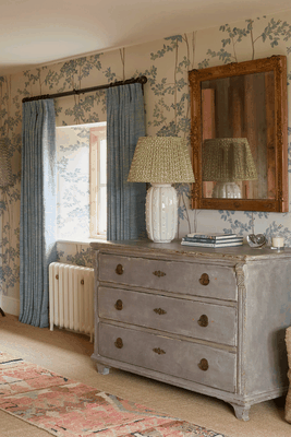
The Blue Guestroom
The guest bedrooms in the house are ‘the blue room’, ‘the pink room’ and ‘the yellow room’. Blue bedrooms can feel cold, so I wanted to make sure this was a warm and enveloping colour to create a room that would feel cosy but still bright. We had the colour specially mixed for us by Mylands – it’s a slight alteration to one of their blues called ‘Long Acre’. The chest of drawers was an existing piece, otherwise we had a completely blank slate in here. The artwork we commissioned from Sophie Mason. Sophie creates the pigments herself from plants and flowers. They are beautiful and introduce a lovely pop of colour above the antique chest of drawers. We used these lovely heavy blankets from Maud Interiors in each of the guest bedrooms, but this colour worked particularly well in this room. The curtain fabric is Teyssier, the headboard fabric is Christopher Farr, the bedside tables are OKA and the lamps are by Pooky.

The Yellow Guestroom
We wanted to create a warm bedroom using natural textures and different shades of yellow. The wallpaper is an old Farrow & Ball design that I love, but this is an archived colourway we searched hard to find! Our client wanted a Soho Home bed so we chose this one in a lovely ochre velvet. I love the chunky rug that was woven for us by Coral and Hive. It feels so warm and comfortable underfoot and looks great layered on top the sisal flooring that runs throughout the first and second floors. The curtain fabric and lampshades are both by Fermoie.
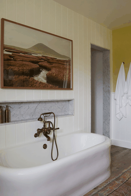
The Yellow En-Suite
This is the en-suite to the yellow bedroom, so it had to be yellow too. We picked one of the colours from the bedroom wallpaper (an archived Farrow & Ball colour called Gervase Yellow), so it complemented the bedroom perfectly. I didn’t want the yellow to be too overpowering, so we paired it with both full and half-height white painted panelling. To ground it all, we used natural wood tones, a dark vanity and bronze sanitaryware. The photograph above the bath is by Richard Gaston. The lights are by Fritz Fryer, the vanity is Porter Bathroom, the brassware is The Water Monopoly and the rug is Tate and Darby.

The Pink Guestroom
The pink bedroom is painted in ‘Threadneedle’ by Mylands, which manages to feel warm without looking salmon-y. It’s the smallest bedroom, but we didn’t want it to feel less important than the others so we opted for a bold headboard fabric, breaking up the pattern with a deep buttoned style of upholstery. The bedside tables are the client’s own; the brass and glass worked well with the colour scheme so we reused them here. The cushions we had made in a Lewis & Wood velvet, the blanket is Maud Interiors, the headboard and curtain fabrics are Fermoie, and the lampshades are Pooky.
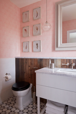
The Pink En-Suite
The wallpaper is a very pretty print from Cloth & Clover. As with all the other bathrooms, we wanted them to be full of interest and really comfortable spaces to use. The floor tiles from Claybrook Studio are my favourite element in this room – they are just so pretty and worked brilliantly in this small space. The vanity is from Ham Interiors, the lights are Fritz Fryer and the mirror is OKA.
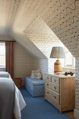
The First Attic Room
We knew printed wallpaper would really make the most of the charming sloped ceilings on the top floor of the house, so the wallpaper was the starting point for this scheme. The client already owned this chest of drawers which was the perfect size to sit in the dormer window. The raw timber is a lovely addition to the room. The bedside lights also came with the client, but we had them repainted in yellow to give them a new lease of life. The wallpaper is my favourite part of this room – it’s such a clever design by Ottoline. The lamp and shade on the chest of drawers are from OKA, the blanket box is Sofa.com upholstered in Molly Mahon fabric. The flatweave rug is RugVista, the curtain fabric and bedside lampshades are by Fermoie, and the spotty bedlinen and blankets are from Zara Home.
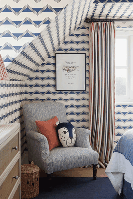
The Second Attic Room
As with the other attic bedroom, we wanted to make the most of the pitched roof and use a pattern all over it. We paired the Ottoline zig zag wallpaper with embroidered curtain fabric from G P & J Baker and fun bedlinen to create a boys’ bedroom that was full of interest. We reupholstered the chair in a spotty fabric from Rapture & Wright.
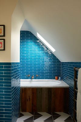
The Children’s Bathroom
Our client wanted a blue bathroom for his sons, so we used Bert & May tiles that run half height around the whole room and full height in the bath area. The framed vintage Snoopy playing cards and brush pots add little splashes of colour. The angles of the ceiling and the way the bath is tucked into the eaves is so interesting. I also love the juxtaposition of the reclaimed timber bath panel with the graphic floor tiles from Claybrook Studio.
Visit FentimanDesign.com
Photography by Kristy Noble. Visit KristyNoble.com and follow @Kristy_Noble on Instagram.
DISCLAIMER: We endeavour to always credit the correct original source of every image we use. If you think a credit may be incorrect, please contact us at info@sheerluxe.com.