

The Off-White Paints Interior Designers Rate
All products on this page have been selected by our editorial team, however we may make commission on some products.
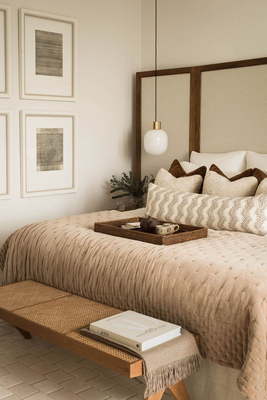
ALBION NORD
Geraldine Apponyi
This is quite a bright, fresh white, but it still has enough pigment to take the edge off. It reacts beautifully to light, changing whether it is bathed in sunlight or candlelight, and gives rooms an almost ethereal atmosphere.
Elegant and calm, this versatile white has a hint of black mixed with earth pigments. It lends itself to different schemes, bringing out either its warmer, earthy tones or highlighting the neutral hint of warm grey.
'Rose Tinted White' Edward Bulmer
This is another one that adapts beautifully to the scheme and the light. Yes, it has a hint of pink, but really just a hint. It is subtle and not sugary. It’s a warm, enveloping colour, with just the right amount of softness and femininity.
This is a slightly brighter, purer white, with a hint of ochre to warm it up. It feels fresh and a little more modern, without being stark.
Visit Apponyi.co.uk
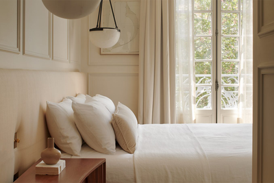
Emma Milne
'Slate II' Paint & Paper Library
This is our failsafe, most used off-white. It suits all styles of interiors and goes well with pretty much any other colour. Think of it as a soft, chalky, warm grey white.
’Stone II’ Paint & Paper Library
Warmer than ‘Slate II’ and better suited to more traditional interiors, ‘Stone II’ is particularly effective when used with the other colours in the Stone Architectural range from Paint & Paper Library.
’Shirting’ Little Greene Paint Company
This is a starchier, cleaner off-white, when only an as-close-to-pure white will do. ‘Shirting’ is based on natural minerals without optical brightener – a heritage white, it’s ideal for both classic and contemporary schemes.
Visit EmmaMilne.co.uk
BANDA
Bee Osborn
This is a calming off-white stone colour that’s versatile and soft. Even better, it just seems to blend with everything.
'Cotswold Fleece' Fenwick & Tilbrook
The perfect off-white that is warm yet bright, Cotswold Fleece is a calming neutral that was inspired by the colour of spring lamb’s wool in the Cotswolds. It can be used for walls or on the ceilings or both.
'Skimming Stone' Farrow & Ball
Slightly darker than the other two, this is a beautiful shade of pale taupe – and very elegant. I find it’s particularly suited to soothing bedroom schemes.
Visit OsbornInteriors.com
Christian Bense
'Slate I' Paint & Paper Library
My go-to is always Paint & Paper Library ‘Slate I’. The guys in the studio have to come prepared if they want me to use anything else on a project. It’s the perfect shade, and can lean both cool and warm, so it’s a no brainer if you’re stuck.
‘Sand I’ Paint & Paper Library
My arm has been twisted lately to start using ‘Sand I’ from Paint & Paper Library. We’ve used it in more traditional homes where we needed things to feel a little more aged and worn in. It’s got the subtlest of yellow undertones, which works well to warm spaces up.
Visit ChristianBense.com

OSBORN INTERIORS
Murude Katipoglu
A chalky off-white hue is ideal for enhancing woodwork such as skirting, window frames, and architraves. Its subtle charm adds a timeless touch and works very well with off-white wall colours.
This is a red-based neutral from Farrow & Ball that I use often on my projects, particularly in spacious rooms. The warm undertones infuse a sense of cosiness and depth, making it an excellent choice for creating a light and inviting space.
This limewash paint creates a light background with added texture and depth that complements any scheme.
Visit Murude.com
Isabelle Lomas
'Portland Stone Pale' Little Greene
This colour has been my favourite for the past few years. It has a calming tone to it and, when the sunlight hits, it becomes soft and warm.
I also really like ‘Slaked Lime’ or ‘Slaked Lime Mid’ as an off-white. It looks very nice in bathrooms as it has a cooler undertone, so works nicely with marble, blue hues and darker stones.
I recently used this in a front room. It has a nice, shaded pigment to it with some taupe undertones. It’s great for rooms with lots of light, like kitchens.
Visit IsabelleLomas.com
EMMA MILNE
DISCLAIMER: We endeavour to always credit the correct original source of every image we use. If you think a credit may be incorrect, please contact us at info@sheerluxe.com.