
A Master Of Colour Shows Us His Country Home
The Property
Court of Noke is a William & Mary period house made from mellow brick and surrounded by water meadows. It was the river that brought us here, as my family have woodland nearby. The house captured our hearts and by sheer good luck we got the opportunity to buy it, complete with its meadows. It was in good condition but what you might call ‘unimproved’ (since 1750 effectively) so we had to start from scratch.
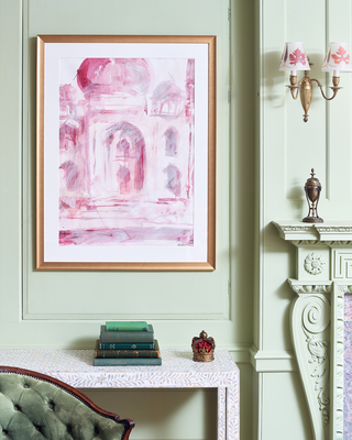
Using ‘Pomona’ – a soft apple green – in the family room
We wanted a scheme full of complementary opposites – it’s why we chose ‘Pomona’ green, as it had the same kind of weight as the pinks we were using, particularly the pink sofa. We created a larger family room from two smaller, plain spaces and decided to use panelling to hide any odd joins; it also enabled us to insulate the two outside walls. Luckily, we found an original flue that we could flaunch into and keep the new fireplace central, so the room is completely modern but still in the style of c.1750. The oak floor is made from two trees that fell on the farm and we had planked. We bought the hand blocked bed covers that are now the curtains on a trip to India, and I painted the framed Taj Mahal pictures. We made our own sofas, too – something we don’t do anymore – and the pink leather and fabric was chosen by my wife, Emma. The rug was woven for us to a Bessarabian design in its original colourway.
Using ‘Lilac Pink’ – a warm pink-beige tone – in the hallway
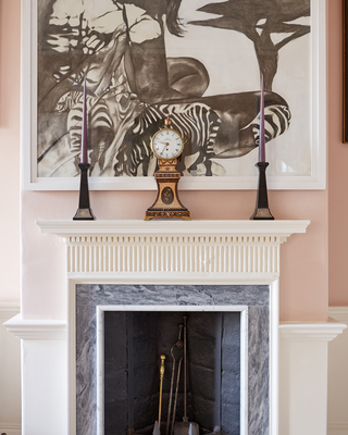
The entrance really is the heart of the house, as it incorporates the staircase at its rear. We introduced the black marble chimneypiece, which is inlaid with the creatures who live in the river. The floor is old pine boards, but the ceiling is false to hide beams and is edged with a new but Regency-style cornice. The colour is a warm grey/beige/pink tone which makes a strong but calm backdrop for the artwork – which is a mixture of old and new.
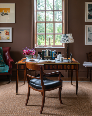
Using ‘London Brown’ – a red-ish chocolate brown – on the office
In lockdown, we all had to make changes. For us, it meant moving the design studio and office into the house and leaving the paint company in the converted farm building we previously shared. We had fun with the decoration, choosing a colour that we thought deserved more airtime – ‘London Brown’. My writing table is a recent find from Lorfords – it’s ‘out of period’ but I love the inlay.
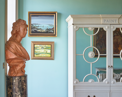
Using ‘Turquoise’ – warm yet fresh – in a hall
Another under-rated colour is this warm ‘Turquoise’ – it’s summery in winter and fresh in summer, plus, it’s a great backdrop for the artwork we’ve collected and the original flags we saved from the old wash house.
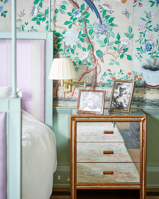
Using ‘Verdigris’ – a blue-based green – in the main bedroom
The woodwork in this room is painted in ‘Sea Green’ and ‘Verdigris’ – perfectly off-setting the glory of the early c.19th century Chinese wallpaper. We had to have it extensively restored and then designed a bed and curtain cornices to compliment it – we kept our curtains simple deliberately.
We found the fabric for the headboard on an old piece of furniture which was originally made for a project at Home House. Green and purple were used again as they’re so complimentary, while the blue and green combination is particularly prevalent in the Chinese wallpaper.
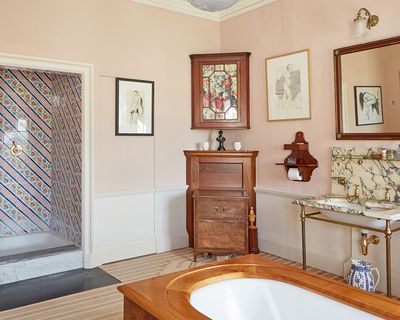
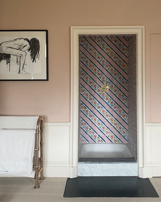
Using ‘Cuisse de Nymphe Emue’ – the ultimate grown-up pink – in the bathroom
For me, pale pink can be both joyous and serious if it’s mixed well. By that, I mean using enough earthy pigment to stop it looking too metallic. It works well with the cherry bath surround, the old marble and the monochrome artwork (the large one by my eldest daughter Isabella depicts her middle sister). The printed curtains are the Welbeck damask design from the Watts of Westminster archive.
Using ‘ Lavender’ – a smokey mauve – in the kitchen
Purple is not usually first choice for any kitchen, but when we started designing our paint collection, we made sure to include a dusky purple that was not being made elsewhere. We used it here to complement the hand-painted green tiles behind the AGA and the green marble squares embedded in the island worktop. ‘Buff’ is a perfect beige to complement the dusky tones.
While we kept the existing AGA, we completely remodelled the rest of the kitchen, taking out an old staircase and inserting two new sash windows. The space also opens into a new conservatory which is where we eat. Though not really a fitted kitchen, everything you need is where you want it, and the AGA acts as a cooker and central heating.
Visit EdwardBulmerPaint.co.uk
DISCLAIMER: We endeavour to always credit the correct original source of every image we use. If you think a credit may be incorrect, please contact us at info@sheerluxe.com.