

Meet The Interior Designer: Laura Stephens

The Background
Whilst always being obsessive about finding beauty in my interior surroundings, I started off my career as a Geography teacher. I ran a busy department in a large secondary school when I became pregnant with my first daughter. I didn’t find having a baby and being a teacher compatible and re-trained in Interior Design at Chelsea School of Art and Design.
Because this was a second career and I was building it around three young children, I was never able to cut my teeth by working for a studio with the hours that involved. Therefore, I started off slowly on my own, firstly by running a small business sourcing and restoring furniture and then building up to designing single rooms and then taking on larger projects. I very much learnt on the job and whilst this may have made the learning process slower, it enabled me to create a business which has been compatible with bringing up my three girls.
Style & Ethos
The joy of my work is delivering a project which is tailored to my client, and whilst I have my own quite distinctive aesthetic, each project is very much my client’s own taste although there’s definitely a thread running through each one of colour, elegance and unique details.
My personal style is feminine and elegant. I love to use colour and pattern in my work and whilst I am drawn to traditional interiors, I want to make that look work for modern living.
Design Inspiration
I find my inspiration in so many things. From nature (my youngest daughter is a budding horticulturalist and her flower pressings and drawings constantly inspire me) to visiting grand old country houses. I have mountains of coffee table books and I am a huge fan of American designers, including architect GP Schafer and interior designers Bunny Williams and Jeffrey Billhuber. I love living in south east London, which has an amazingly creative community and I am constantly discovering local artists and craftsmen who always inspire.
Approach to Colour
I am drawn to softer colours but having said that some of my favourite projects recently have been using deep reds and ochres. Even if I use a gentle colour palette in a scheme, I like to give things a little edge to prevent things looking too predictable and safe - a black and white stripe amongst florals, for example, or a deep mustard in an otherwise natural scheme.
I know brass has been fashionable for some time but it’s also very traditional and I love the warmth and patina unlacquered brass brings to a room and I always use it if budget allows. I have a deep love for floral fabrics, from blousey chintz to Indian block print fabrics. I recently used Pukka print fabric for my own home, which encompassed my dream print and colour palette.
Finishing Touches
In almost every project I like to add passementrie, from tasselled tie backs to bold twisted piping. Artwork is really important to complete and personalise a room. I’ve recently worked with a company called The Art Department who have developed a collection based on ‘my world’. They include lots of pretty detailing and I can’t wait to use them in my projects.
Instagram Accounts I Follow
Favourite interior inspiration on Instagram are @clarkyoconnell who curates the most beautiful images, @robertkime for his interiors and divine fabrics and @archdigest for insane uber high-end interior porn.
01
FAMILY HOME
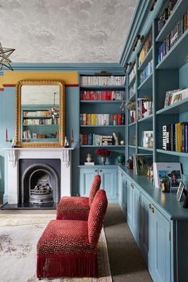
The brief for this project was to completely redesign three rooms: one reception room to create a beautiful adult space which linked to the conservatory and garden, and to turn another reception room into a playroom/library. It was to be chic but whimsical and fun. And finally to redecorate a little downstairs WC. My client loved antiques, colour and traditional décor and had a clear vision for what she wanted but really trusted me entirely to realise it.
The playroom was inspired by the 1940s and the Orient Express. I wanted to deliver beautiful details, upholstery and joinery inspired by that age. The Cole & Son wallpaper on the walls adds the perfect note of whimsy to the room, which has a really magical feel.
I had so much fun with the colour scheme for this project. I knew I wanted to use red and blue for the playroom but in a grown-up way. The joinery is painted in Oval Room Blue by Farrow & Ball and Sudbury Yellow (Farrow & Ball) in the freize serves to break it up. I added striped red blinds to bring a more child-like feel to the scheme.

One of the loveliest pieces of furniture is the little Ikea kitchen which my client expertly upcycled, painting it Sudbury Yellow and adding the little gingham curtain. We sourced little bobbin chairs which are so full of character and the perfect height for children. The joinery was wrapped about the whole room and encompasses the piano space and also contains storage for toys.
The little WC was a total joy to design. The wallpaper is House of Hackney and we pulled out the coral pink for the woodwork and back of the door. I added a mini chequerboard mosaic on the floor for contrast. I think it feels like something from Alice in Wonderland
For the adult reception we added panelling to the lower half of the adult reception room and a leafy pretty wallpaper from Colefax & Fowler, which links the room with the outdoor conservatory. The reception room furnitue is almost all antique and sourced from Vinterior, decorative collective and eBay. We used my client’s quirky side lamps and added bespoke animal print shades to inject an element of edge and fun.
02
BICKLEY HOME

This client wanted me to create a beautiful family home and to help introduce character to a her contemporary home. She knew exactly what she loved and had such enthusiasm for fabrics and colour; I can truly say that she inspired me on this project - we made for a great team.
She inherited the panelling in the hallway and loved, but it was a dark brown colour. The whole space was sanded back, re-stained and beautiful lighting added. We designed a bespoke storage bench for shoes with beautiful cushions and a stunning Julian Chichester mirror plus glamourous lighting from Tigermoth.
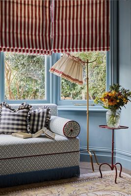
One of my favourite elements of the project is the landing. The client has young children and wanted a space on her generous landing to be devoted to books and reading stories. I designed the window seat to be feminine and elegant and deep enough to snuggle into and floor to ceiling joinery to hold books. The client shared my love of beautiful fabrics and trims and gave me carte blanche to really go for it with the cushions.


Luckily, this client adored colour and was up for painted ceilings, and bringing in colour and pattern wherever possible. It was a joy to do the cloakroom with green ceiling, Lewis & Wood wallpaper and clashing printed wall light shades by Rosie de Ruig.
I have two favourite pieces in this project, both in the client’s dayroom – a space to call her own where she could relax, write and escape too. I designed the most playful daybed and the headboard and piping and cushions give a feminine and whimsical feel to the space. We sourced the beautiful Gustavian bureau from Georgina Lacey antiques and had it painted a bespoke shade inside to match the green of the leaf in the wallpaper which came from Christopher Farr.
Finally, a bathroom was updated by adding beautiful scroll leaf wallpaper from Common Room; a sweet Swedish blind with ribbons and polka dot linen and shall wall lights from Jim Lawrence.
03
EDWARDIAN HOME

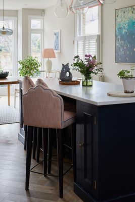
The brief for this project to was to inject some colour and pattern into the kitchen and to breathe new life into a study and guest room. We wanted the study to feel suitably masculine but to add colour and warmth.
I love the mix of materials in this space. The study desk and chair are antique. We added grass cloth wallpaper to bring in texture and colour. I wanted to add this beautiful soft plum colour to the joinery and we picked up on it on the upholstery of the ottoman which transforms into a fabulous double bed.

The existing guestroom was bland and needed a focal point so I designed this scalloped headboard to provide a focal point. I love the stud detailing and yellow piping. The yellow is picked up elsewhere in the form of the fabulous Orchard Taylor lamp and Alfred Newall bobble mirror. We added prints from Antoinette Poisson and upholstered an antique chair in ‘Wilde’, a favourite animal cut velvet fabric by Colefax and Fowler. The room feels super pretty layered with several small but co-ordinating prints and also really serene.
The kitchen needed a little softening in terms or materials and colour so we added some lovely Fermoie lampshades, pretty blinds and these stunning upholstered bar stools in my signature scallop.
Visit LauraStephens.co.uk
Photography by Chris Snook
DISCLAIMER: We endeavour to always credit the correct original source of every image we use. If you think a credit may be incorrect, please contact us at info@sheerluxe.com.