

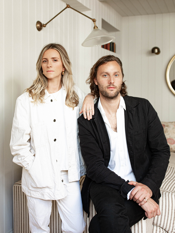
Meet The Interior Designer: Salvesen Graham

STYLE & INSPIRATION
Our Background
We met at Durham – where neither of us were studying interiors – but a few years later we were both working for interiors practices and met up to talk about the industry – its challenges and our successes, but also how we wanted to see it become more professional. As time went on, we realised we both wanted families and careers, so by forming a partnership in 2013, we knew we could keep the business going as a team. Now, there are six interior designers, and two additional members of staff who work on the product side. We normally have ten to 15 projects on the go at any one time, with ten usually active, and the others starting or finishing.
We both trained at KLC and started out working for ‘old fashioned’ decorators – who were real mentors. The courses are a great way to understand the foundations of good design and learn the technical side. Dealing sensitively with different clients is only something you can learn on the job.
Style & Ethos
What we create is timeless interiors that have a fresh and useable feel to them – in other words, they need to last. We look back at projects from when we first started, and they still feel as relevant now as they did then. We often start with something traditional and try to bring it up to date. For example, one of our wallpaper designs for our new collection is based on an old-fashioned ‘Tree of Life’ pattern – only with a bit of white space to make it feel fresh. It’s fine to incorporate a fun cushion or seasonal accents, but the bones of the scheme must feel timeless and well-proportioned to make room for them.
Colour & Materials
We do have a Salvesen Graham signature colour palette – mustard yellow, raspberry pink, olive green, deep blue and pale blush. By building them into our product collection, we can show people how to introduce these colours in small ways. If a room looks too tonal, it’s good to throw in a multi-coloured element. It’s an easy way to incorporate more colour if you’re scared of it. You can also pull out the colours you’re comfortable with and add more when you feel braver.
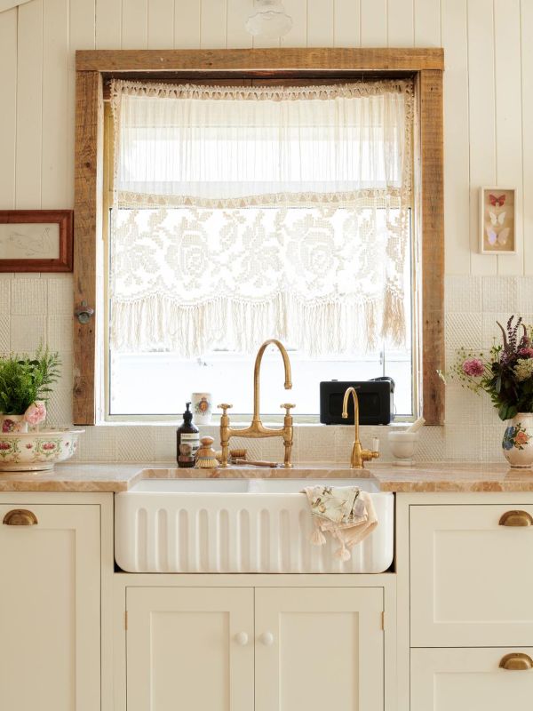
We’re big advocates of using antiques in interiors, too. Aesthetically, they’re often more beautiful and from a sustainability point of view, you’re extending the lifecycle of a certain piece. They’re usually better made, as well, and you can always make them look more modern with some clever styling – simply put a brightly coloured lacquer tray on top of a brown side table to make it pop.
Antiques can give a room weight and character. While they work well in a period property, they’re useful in a home which has been stripped back, too, as they add back in detail and interest. Our mantra is, as long as the design is good, it doesn’t matter what period it’s from – it will sit well with something else of quality design – think a Georgian table with a 1970s Murano glass lamp.
Signature Motifs
We’ve always used scallop motifs in our designs. Now it’s become such a trend, but our scallop rugs are still so popular. We’re lucky our clients are usually on board with us – we love ruffles, pink and florals, but we make it work by layering. That way, you don’t enter a room and see just one thing – for example, a floral wallpaper could be juxtaposed with an ethnic fabric on an ottoman to take the edge off it. In our new wallpaper collection, the zigzag motif is an archive design, and the nice thing about it is that it isn’t masculine or feminine. Again, it works so well in a layered scheme.

Design Approach
We’re pretty straight with our clients when it comes to moving forward with a project. So many people go in not knowing what they’re embarking on and not everyone gets clear advice – it’s one of the main things we want to get right. We’re not afraid to advise clients to wait so they can do everything in one go. Even if someone wants to embark on a project in phases, we’d suggest they design it in one go first, before implementing it gradually.
The Collections
As well as working on collaborations with rug designer Jennifer Manners and furniture designer David Seyfried, we’ve also created our own line of products, including painted bamboo furniture, lighting, cushions, and home accessories. Tables – side tables, bedside, and dining tables – are something we’re always looking for, so we have those going into production soon.
Our mission is to offer up our interior designer knowledge via our product range – we’re used to looking at 500 different fabric samples or wallpaper designs, but most people aren’t, so we want to take the hard work out of it. All our products are designed to work together, but you can also pick and choose from the range. Certain pieces can ever be semi-bespoke – for example, a full or half skirt on a chair. This week, we’re also launching a range of wallpapers and fabrics. The designs have their origins in archive prints, and it’s been interesting to see how bold previous generations were when it came to colour and pattern. The collection will work in both town and country houses – it just depends on how you use them.
01
Marylebone Townhouse
Photography: Alex James
We rarely take on a project that isn’t a whole house, but this room was an exception. It’s joyful, energetic and there’s a huge amount going on, but it’s also calm. Our client wanted to come home from a demanding job and be comforted by his surroundings. Pattern on pattern can work well – it’s common to think they’ll fight with each other, but these ones don’t.

We were introduced to the client through an art consultant and his own art collection is stunning. The wallpaper is from De Gournay – most would agree it’s unusual to cover De Gournay wallpaper with massive paintings, but it makes the room feel confident and adds integrity to the scheme. We couldn’t change the cornice detail as the home is listed, but we painted on this detailing to elevate it.


02
Battersea Townhouse
Photography: Simon Brown
This is a good example of us tailoring our look to the client’s brief but there’s still plenty of our signature touches throughout – layering, ironmongery detail, high gloss finish on the walls, detailed pattern on the floor. It’s a client-facing home for a composer – his studio is in the basement, and he wanted the space to function for work and home life. The simple décor celebrates the property’s architectural features, but it’s layered with different finishes and details.


The client had some impressive artwork, including pieces by Grayson Perry and Damien Hurst, which we wanted to show off. With its lacquered walls, detailed flooring and ironmongery, the dining room is like a jewellery box. The finishes are important throughout, including the fluted panelling on the doors, the specialist paint finish in the kitchen.
The bedroom is quite monochrome, and we used the same pattern in different scales. In the bathroom we scaled up with a generous sink and a sizeable base in the shower to make the room feel more generous than it is. It’s a signature of ours to use a marble architrave in a bathroom – it’s a smart way to finish it off and not particularly expensive.

03
Surrey House
Photography: Simon Brown
The family inherited this home and wanted to renovate it to suit their needs. There’s a lot of tact required when changing a much-loved family home and it’s about working sympathetically to decide what to change and where to be respectful. Here, we moved the kitchen into the heart of the home and brought the playroom down from the attic. We divided up the vast kitchen space with a glazed nib wall. It pinches the room in the middle to give you two separate ends, without having to commit to another solid wall or doors. The dining room is in the centre of the house, so we used soft furnishings to add decorative interest. The client inherited a lot of brown furniture, so we mixed it up with a high gloss finish on the painted sideboard. In the spaces where we made fewer changes, such as the study, we refreshed it by painting the existing joinery a bold colour.

The clients wanted the main bedroom to be a retreat and to be able to have the whole family hang out in there. One thing we try to do is transition clients from buying high-street furniture in their 20s to choosing more sophisticated furniture and fabrics as they grow. Even if it’s not where you are right now, it’s important to realise that if you’re investing all this money and time, you want it to last. It’s all about future proofing and forward thinking.


Visit SalvesenGraham.com
more from
Home


DISCLAIMER: We endeavour to always credit the correct original source of every image we use. If you think a credit may be incorrect, please contact us at info@sheerluxe.com.